Hemnet's design system journey
During the last two years, Hemnet's product development teams have taken big steps in creating a design system. Today we have a common web platform with shared web components to be used everywhere. We have introduced components and our new graphic profile in many places, both in our apps and on the web. We have communication channels and forums where we work on common design, principles and components.
We have done this together and in alignment with the rest of our ongoing product development, without having a specific team responsible for the design system. Let me share how that was done.
How it all started
When this story began (few years back) we had a web style guide with some common styling and guidelines for how we used typography, colors, etc. Not a bad thing, but unfortunately it had not been updated for a while, it was only used for one of our websites (hemnet.se), in addition it was web specific. Our designers did not use it either, instead they had their own components in Sketch. Both front-end developers and designers wanted to improve this and smaller initiatives started popping up.
We started talking about the benefits of common design guidelines and components - saving time by creating standardized building blocks, improving communication between developers and designers, facilitating for all team members to work independently and make their own design decisions.
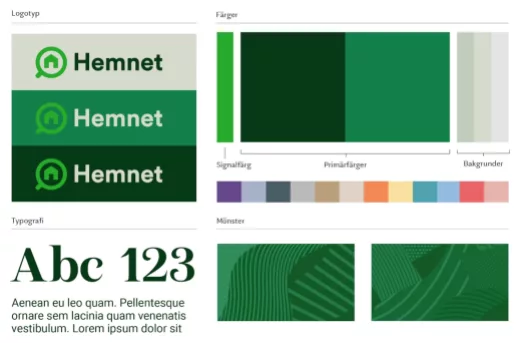
Parts of Hemnet’s new graphic profile
In 2019, a new graphic profile for Hemnet was created, with the help of the brand agency Bold. It included new colors, typography, and a tweaked logo. Of course, we wanted to make this visible in our websites and apps, but we weren’t quite there yet - we needed to find out what the new profile meant digitally.
It became natural to start working with a better design system and at the same time introduce this new graphic profile. We decided that the design system would be based entirely on the new graphic profile. This would also increase the incentives for teams to introduce components from the design system.
Tools and infrastructure
Our new graphic profile was delivered in Frontify, a brand and visual identity platform. We decided to continue using it as a content system for the design system and created three parts:
- Identity: Our graphic profile. The basics, like colors and fonts.
- Components: Common building blocks for our websites and apps, plus guidelines for them.
- Text: Guidelines for how we express ourselves in text and what words we use.
We use Frontify as the place for everything design-related at Hemnet. Everyone at Hemnet has access and it’s easy to edit text or upload images.
A large part of the work with the design system has been about making it possible to create shared web components that can be used on our different websites. Two of our most important web products are hemnet.se and Kundportalen, where property brokers log in and, among other things, manage their property listings.
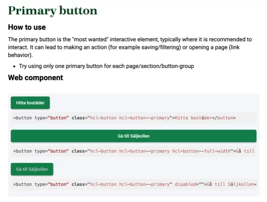
Guidelines and web component in Frontify
How the web component library works technically:
- Our web components are developed in a Git repository, packaged, and imported into our applications (such as Hemnet.se and Kundportalen) using npm.
- We use Storybook to test and demonstrate the components.
- A component can be used via React or HTML / CSS - Storybook contains code examples for both.
- Frontify shows guidelines for each component, and the component itself from Storybook (the part with gray background in the picture above).
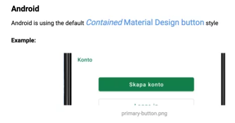
The Android version of the primary button in Frontify
There are of course components for our native mobile apps, but they are more difficult to display on the web and we have currently only taken screenshots to show what the component looks like.
Our designers use Figma as a design and prototype tool. We (manually) mirror our components in Figma to be able to use them in sketches and prototypes, but the actual implemented components are the source of truth.
How we have worked
We have worked with this in different ways during the years. In the beginning the focus was basic work to set up Storybook and make sure our websites used common components. A few representatives from different teams worked on this for a few weeks. We later introduced components (including the new graphic profile) everywhere, created new components and further developed design principles. We have worked one step at a time and prioritized the components that are used the most and make the most difference visually, such as headings and buttons. We have given priority to introducing the components where they are most visible and noticeable.
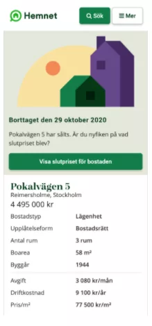
One part of hemnet.se with new design
One or two developers per product team have been “design system representative” and focused on this area one day a week. Sometimes we have had a fixed day where everyone works together, sometimes it has been up to the team to decide when. However, we have always had one meeting every other week where we share our work and raise problems. We also have another forum every other week more dedicated to discussing design details.
In addition, a lot of the communication about the design system takes place on Slack. In the channel we have named #designsystem, we post everything from questions about design details to technical thoughts about the web component library.
Another success factor, I think, has been our attitude - knowing that everything can always change and does not have to be perfect from the beginning. Now that we have common components, a smart improvement can be introduced everywhere with just a push of a button (kind of).
A third success factor is that developers and designers have worked together all the time. At Hemnet we are used to this, but this is not the case everywhere. Designing and building things works best when everyone involved understands both technology and design.
